Research institute websites are often designed as information repositories: accurate, rich in content, yet reserved in their communication style. The project to redesign the INZ website arose from the question of how to open up such a site to a wider audience—without sacrificing its professionalism and functionality.
The primary goal was clear: a comprehensive presentation of the institute. At the same time, we wanted the website to function not merely as a static business card, but as an entry point into the research work. Clear, inviting, and modern.
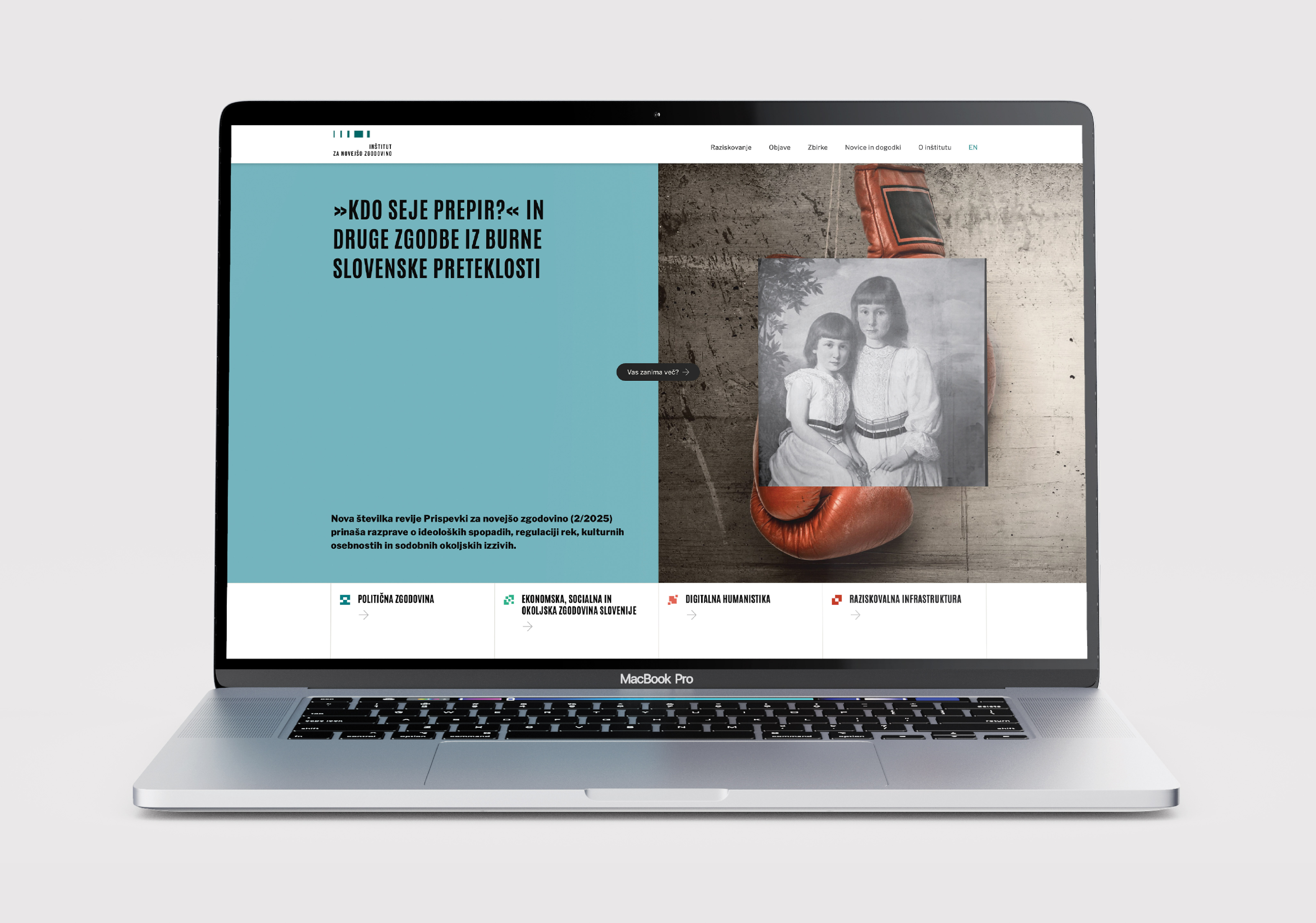
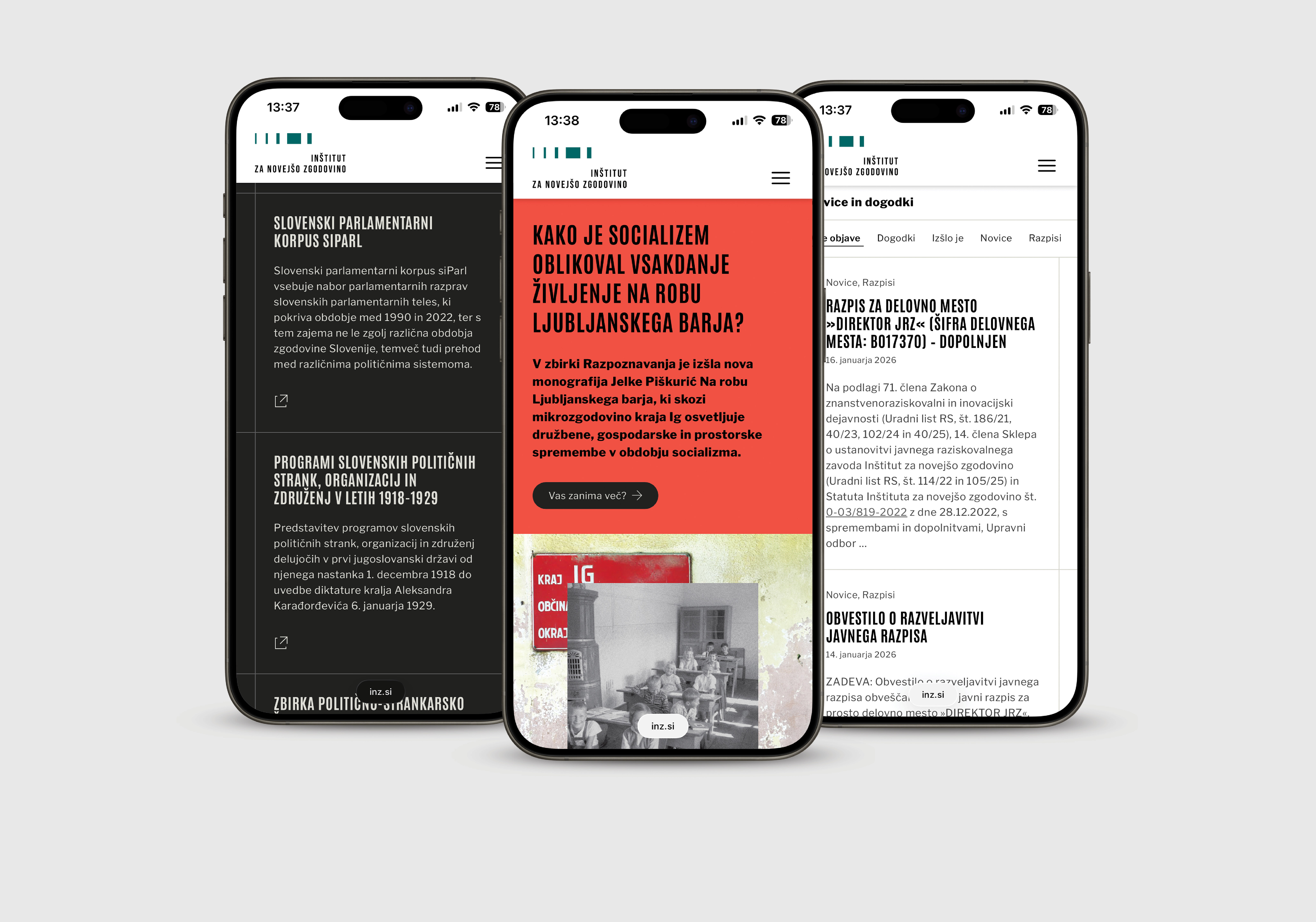
A key shift in design and content occurs right on the homepage. The introductory hero shot serves as a promotional message and deliberately departs from the classic research aesthetic: with a more striking visual style and the “Did you know?” format, it also appeals to visitors without prior expertise. In-depth content, however, is always accessible quickly and directly, without unnecessary steps.
Another unique feature of the project is the monthly editorial and design intervention on the cover. Each month, the central focus and visual design are updated, both prepared in collaboration with experts rather than the in-house editorial team. This approach ensures the site remains fresh, relevant, and communicatively dynamic, while maintaining content consistency and a professional tone.
The result is a website that successfully combines two seemingly contradictory roles: it functions as a reliable institutional reference while also allowing for a more open, almost promotional presentation of the research field.